Overhauling Workflow Progression
Replacing Salesforce's Path component with newly designed and created custom object, “Stages." Includes user flow reworking and settings.
My Contribution
Lead Designer
Userflows, Wireframes, Mockups, Prototype, Hi-fi Handoff, QA Regression, Shipping, Design System
Lead Researcher
Competitive Analysis, Software, additional Discovery, Product maintenance, interviews, SME testing
Company
Business Model
Litify, Inc.
Team
Product Manager
Design Manager
Engineers
QA
SaaS
B2B
Legal Technology
Enterprise Software
Tools
Figma
Figjam
Loom
Chorus.ai (Zoominfo)
Year
2021
Background
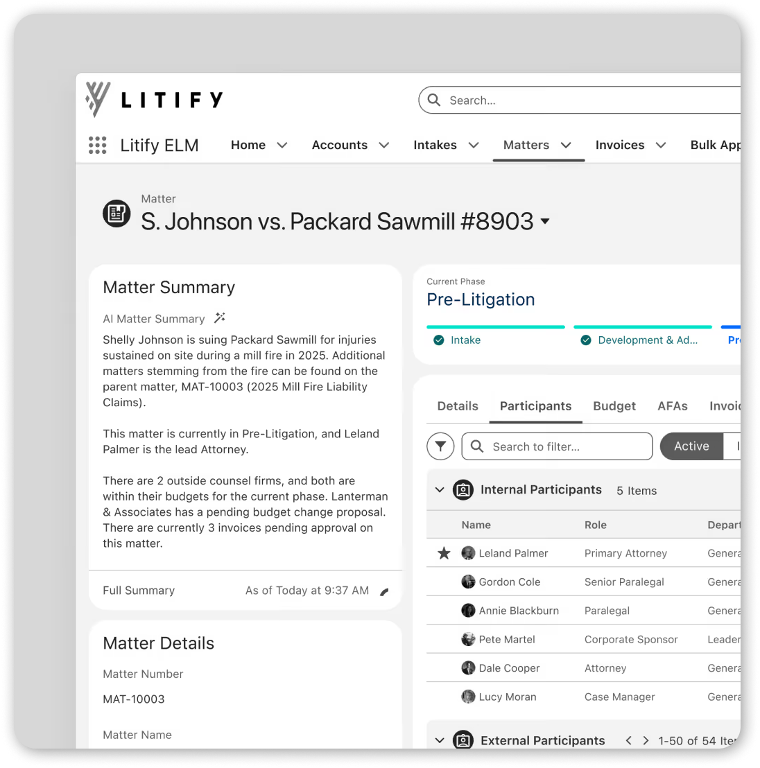
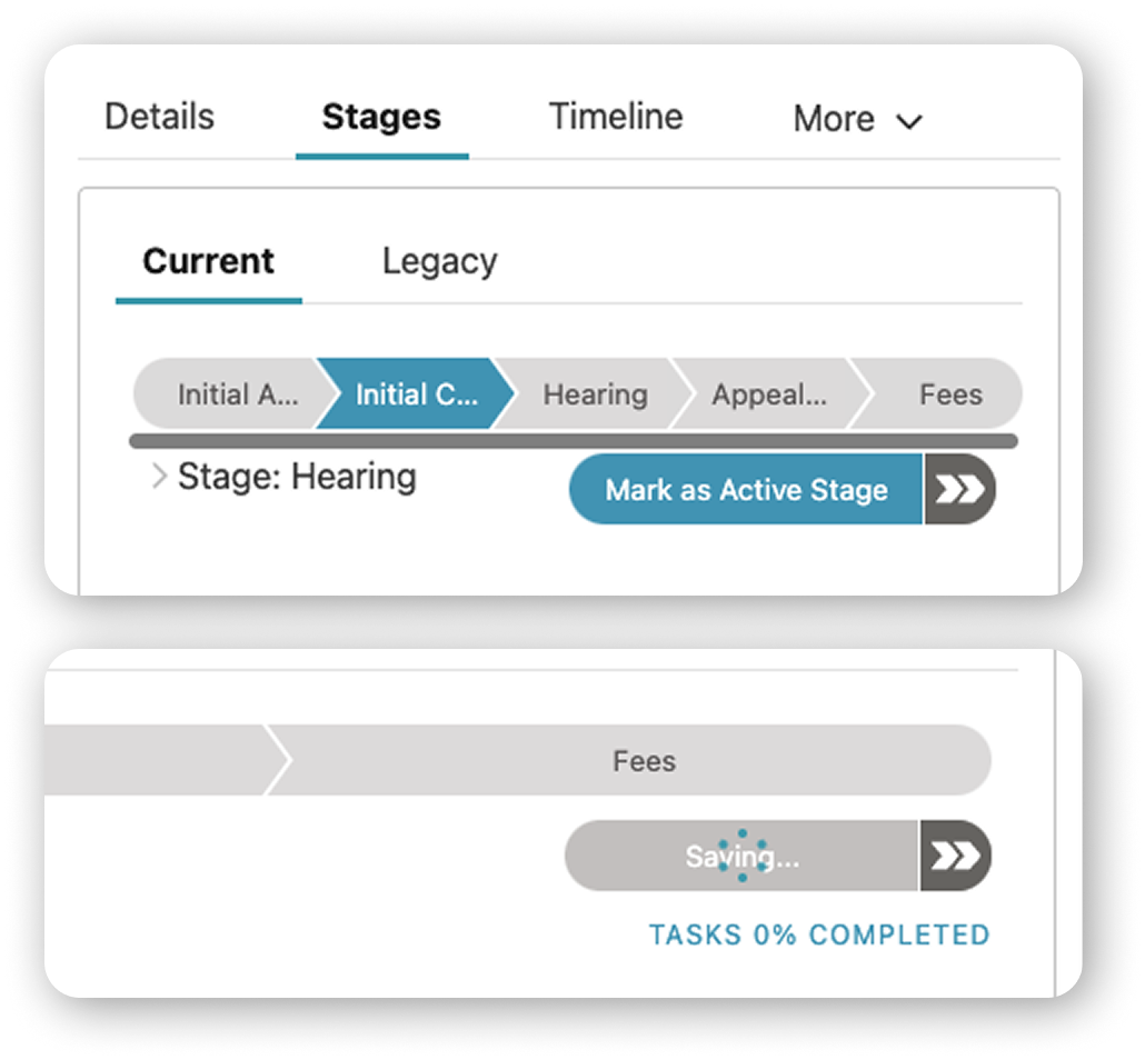
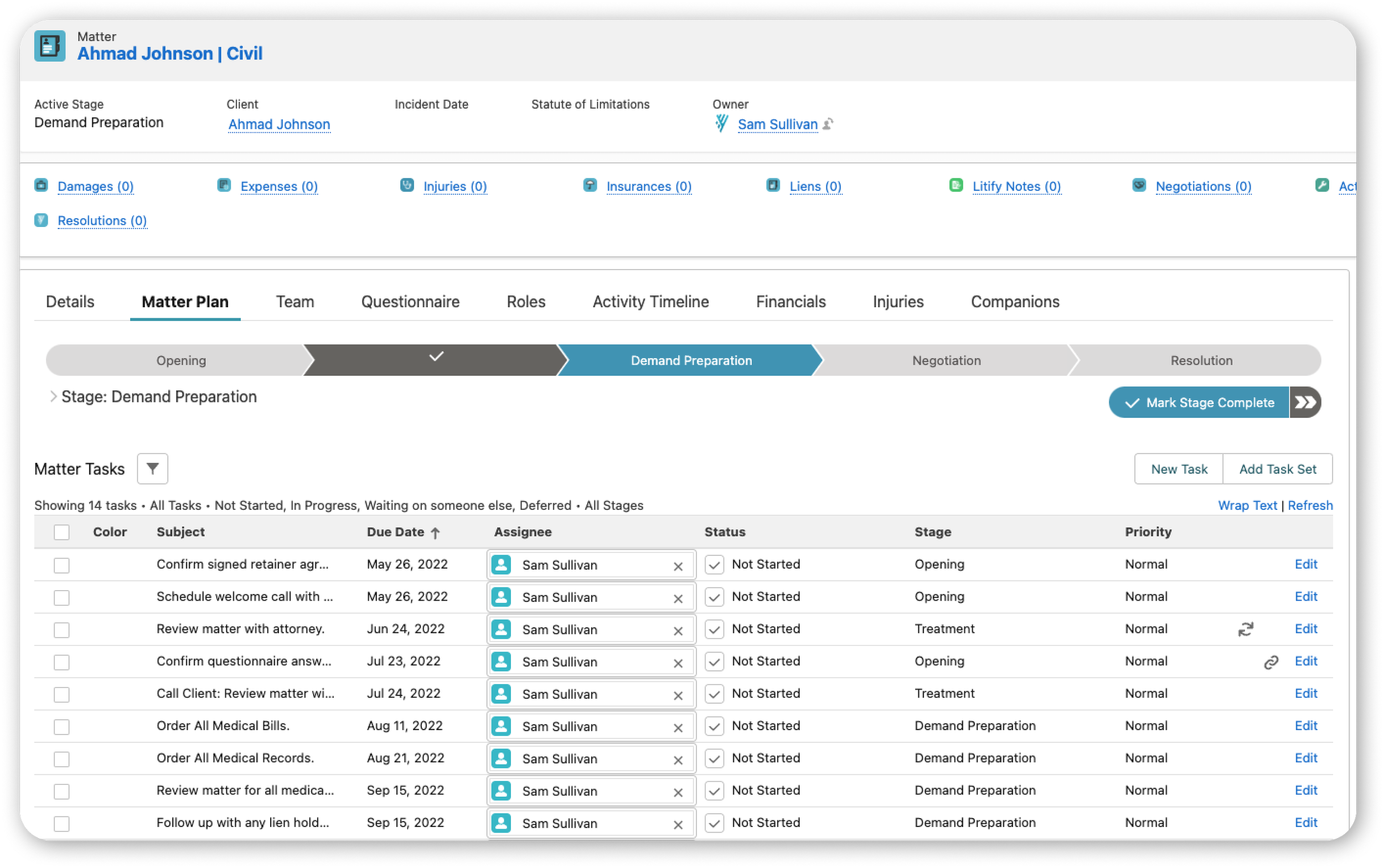
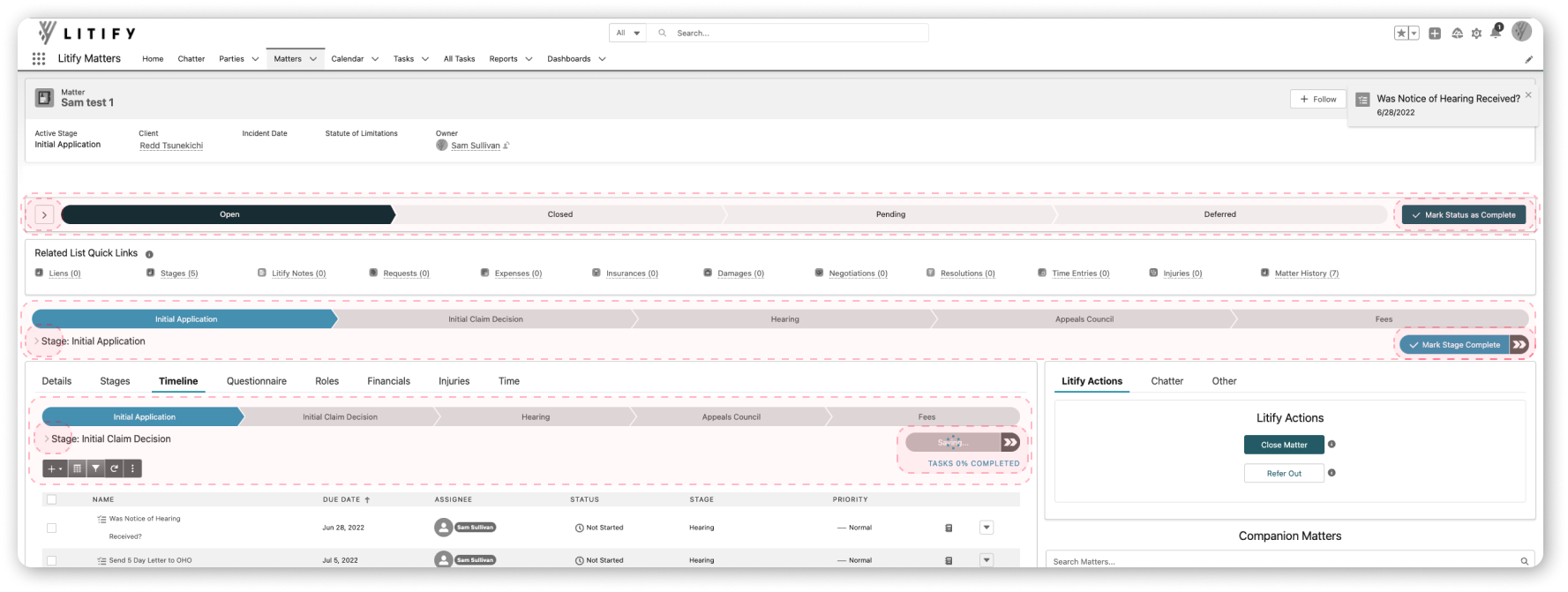
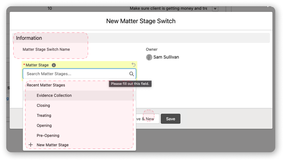
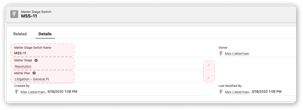
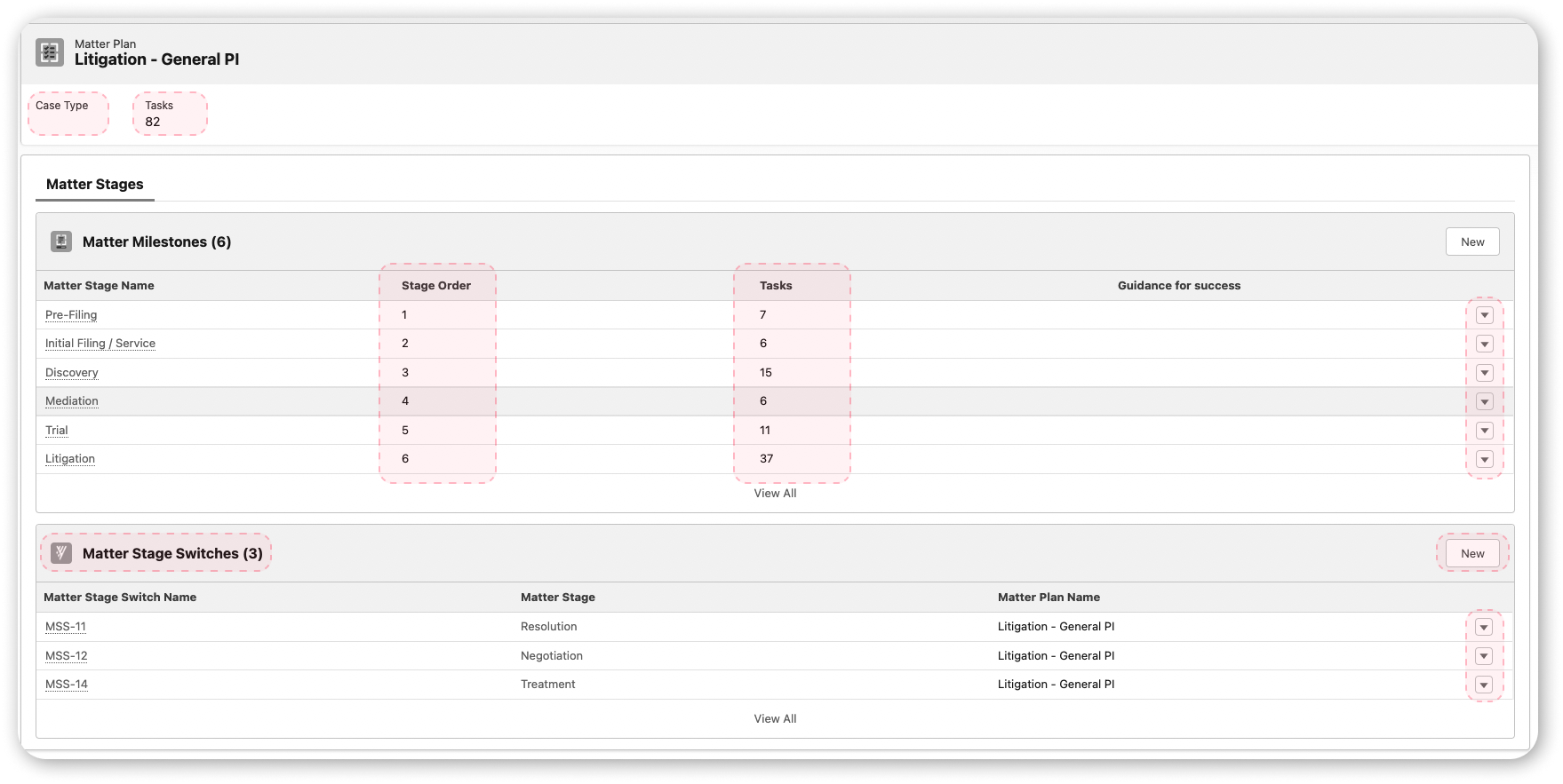
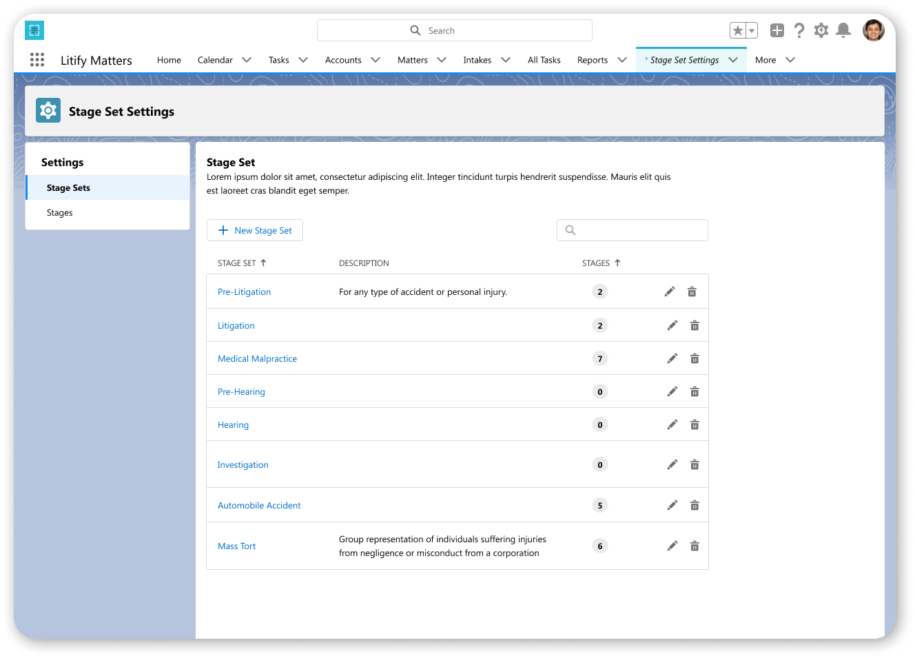
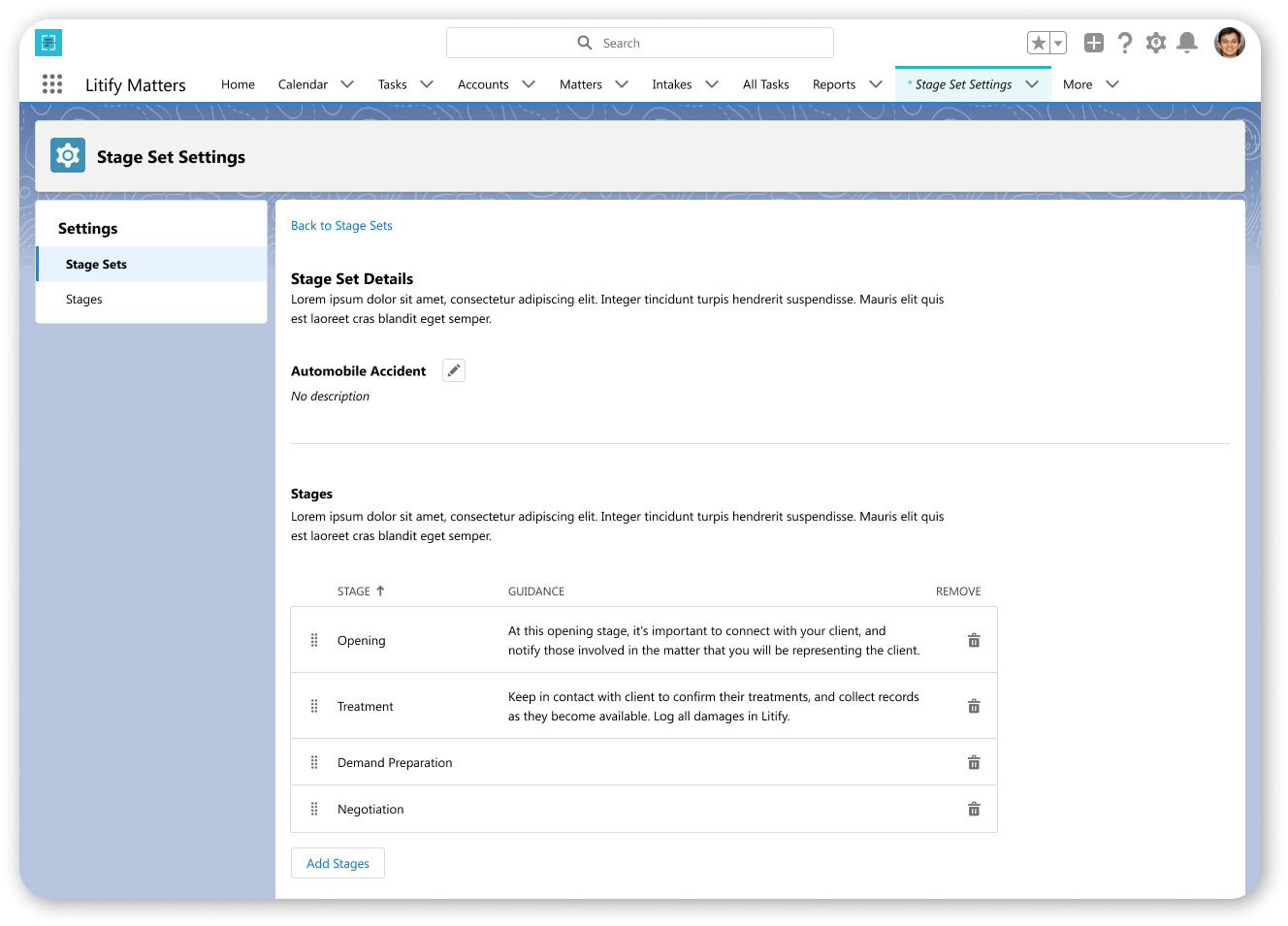
The working cases in law firms are called Matters. Salesforce provides a path component as an out-of-the-box feature; this acts as a progress indicator and an outline with each interval attaching task requirements.
Intervals, or Stages, can technically be reconfigured. The Path ribbon - renamed Stage Set - and many stage options are maintained and templatized by administrators at law firms.
This feature helps track phases and the accompanying requirements over the course of an active Matter.
Problem
The current Path component (front-end) lacks accessibility as the Matter grows to incorporate additional stages, making it difficult for users to navigate the Stage Set.
Its core features of Stage Switch (back-end) and appending stages is confusing to use and is difficult to manage at scale.
Screenshots of current Path component on a Matter
Solution
Create custom object replacing path component to:
reset & update flows
align with updated brand direction
Users
As a core feature of the Matter and integral to the product, the users are many, primarily Attorneys, Paralegals, Legal Assistants, and Administrators. On the backend, the current user is only the Administrator.
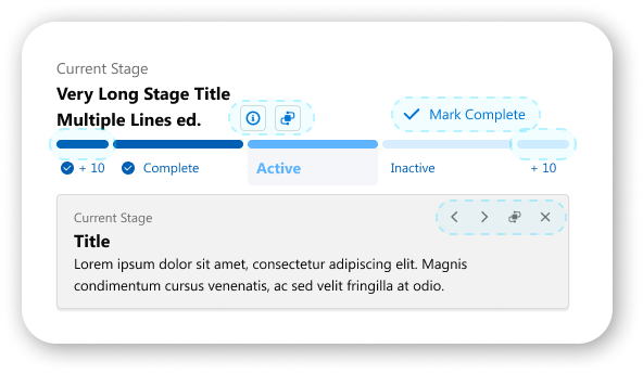
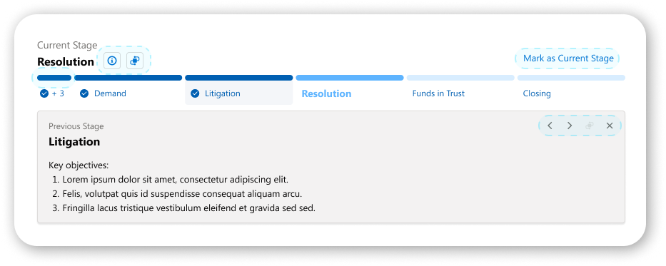
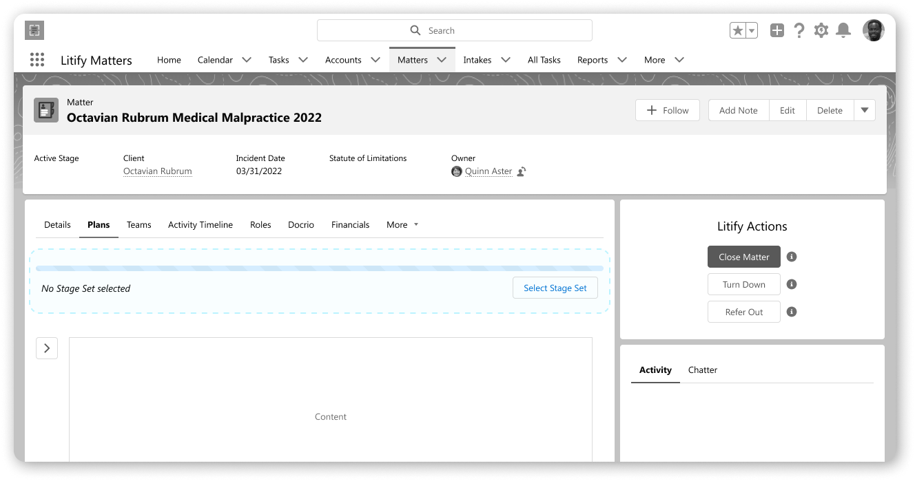
Introducing the new Stages component on a Matter
Challenges
No user testing
Align with sister-product “Task and Teams”
Only provided anecdotal user feedback by director at start
Keep lean since resources are limited this roadmap
Approach
Because of unique restraints and the project’s priority being low in roadmap – but high for our product team if/when had time and resources – a lot of the ancillary ground work was completed ad-hoc.
I wanted to ensure I delivered well enough to the product demands and user requests. Fortunately my team was collaborative and supportive enough for huddles and inquiries as I stuck to the product restrictions.
Research & Testing
With no time allotted to formally conduct interviews, access client support, or user test, I supplemented with inquiring from internal Product department members their experiences and what previous feedback they could remember.
Conversely, scant research was provided by the design director with more focus on the business needs and less on the users’ needs.
To push through, I studied the the current process, mapping out workflows. These had last received updates in 2016, or 6 years prior.
I analyzed the component’s function and pain points.
I reviewed unreleased/in-progress design patterns in same product for style and flow references, with particular regards to brand redirection
To make up for lack of research or access to testing, I spent time looking internally at similar products, functions, and flows, as well as speaking to attorneys in own time and workshopping early iterative designs with other designers at Litify and product manager to make
I researched related design patterns.
Insights, Findings, and Key Constraints
In brief, a return to the user is desperately needed. Introduce quality of life features, make scalable, and let the users guide their own processes.
More comprehensively, the information is detailed below:
Quality of Life
Make wayfinding controls simple and clear
Current path ribbon is clunky and only the most determined users maintain its functions actively
Current path ribbon not intuitive
New functions and updated flow requires new user adoption
No scrolling
High-touch users struggle with current horizontal scrolling
Maintain recognizable progress tracker pattern, but refresh styling
Litify sits between Salesforce software and white label software, so styling here is key to bolster the independence and reflect the value of the product (in part to the higher cost of Litify)
Requirements
Must keep the build lean (utilize pre-existing elements from other builds)
Time allotted is minimal
Recycle custom elements to minimize build time for engineers
Must allow for users to create Stages and sets of Stages without task requirements
Record in log any and all changes
Return transparency through Matter history, archiving user changes in Activity Timeline
Must allow Stages on active Matter to be manipulated freely without upsetting any previous information
Must create custom object for Matter, but aligned with sister-product being overhauled and created (”Tasks & Teams”)
Highlight 1
New Custom Component
Hit fullscreen to explore the primary prototype, or click here to explore on Figma.
There are 9 screen flows under 3 categories to explore the component on the front-end.
There are 6 screen flows total between the Stage Set and Stages to explore in the component set-up.
Highlight 2
Updated & Redefined User Journey
With requirements removed for the Stages component on the Matter, the new user flows simplify user actions while allowing for hyper-customizing of the progression and information, linear and pre-assigned or not.
Highlight 3
Enterprise Tooling
Not only was the previous component unscalable and difficult to follow, it was heavy with task requirements. It lacked uniformity in design as applied.
The replacement needed to be quickly stood up and used by any user. With a high percentage of users keeping the screen at a 9:16 ratio, the responsiveness was absolutely necessary.
1. Scalability
Serve the users with visual progression banner while adding no additional friction to usage. Provide all information needed and clear steps for more. Maintain responsiveness through placements and screen ratios.
a. Navigating
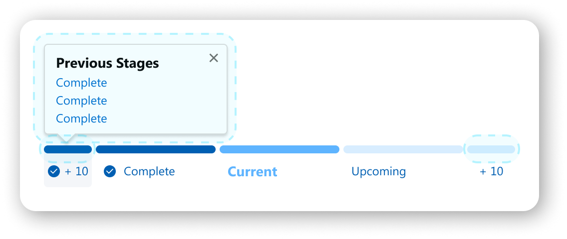
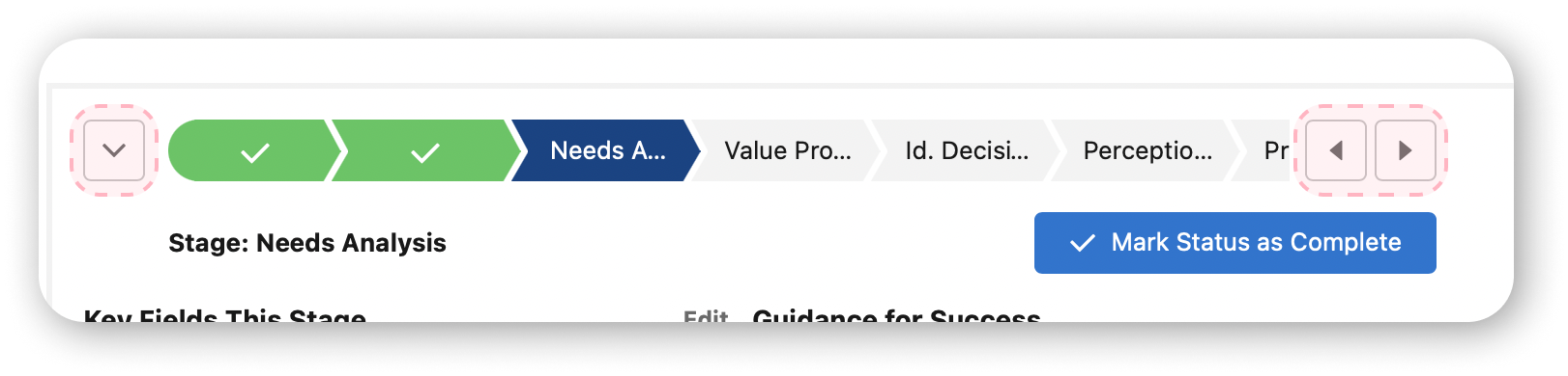
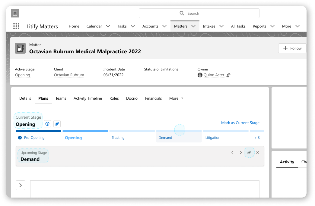
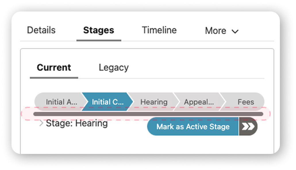
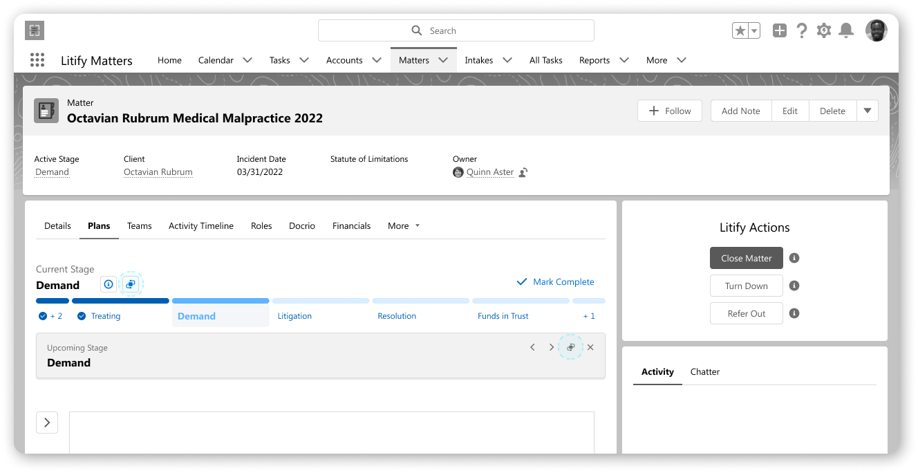
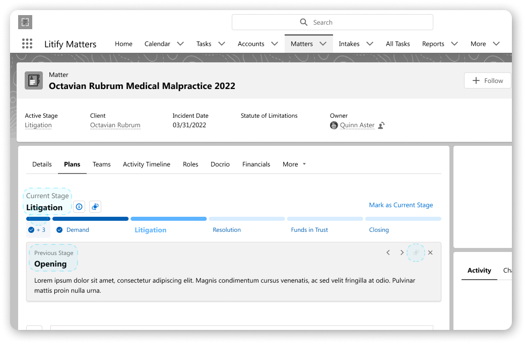
Provide a clear indication of stages within the path ribbon for the user and how to navigate to-and-fro across all screens.
The user no longer needs to resize or scroll to view.
The user can navigate stages in 4 distinct ways now.
Status button
Selecting status pill
Drawer
Popover
b. Controlling
Make the user the operator of the Matter’s stage progression seamlessly without friction in understanding or steps.
Users have clear action buttons to control stage, view the ribbon, view details, switch current stage, and update stage set
Users can perform all above actions without exiting Matter for the Setup
Users can operate equally on wide screens and small screens
2. Usability
Empower users to augment their stage sets naturally as their work progresses: on the fly or with dedicated time and efforts.
b. Directionality
Quick and clear support for all a user’s workflows.
Consistent patterns
Available context
Safe paths
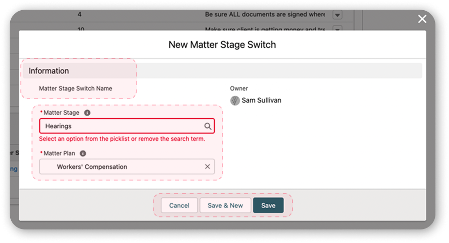
c. Applying
Simplify the onboarding and application for the user.
The Salesforce-provided component can be readily deployed on the Matter when placed, wherever placed. The new component fixes the bulk of the uniformity problems.
Greater styling and alterations are set by the system admin, and the common user is unable to misapply the component.
a. Provisions
Outline for the user the support of their progression through clear access points and confident design.
The user is no longer disrupted or confused when updating their stage set.
The user can update their stage set in 4 distinct ways now.
Button
Drawer
Upcoming Stage
Previous Stage
Button states reduce confusion by keeping linear consistency.
New Stage Sets will all start and behave the same
c. Enablement
Furnish for the user the dedicated space to manage all Stage Sets and Stages.
Hyper customizability allows for tight control by system admin or usage by common users
Every user provided a singular, safe space to work regardless of prior experience
Design retains linear aspect to approaching setup the reigns for fluid assembly

Delivery & Feedback
From the Product side, this has long been on the list, which at times is at odds with the nature of a startup. With my diligence and with close collaboration with my team lead and director, we squeezed this project into the pipeline.
Initially met with pause, we were able to win over stakeholders by showing how cleverly built this is, which is to say, how little resourcing is required to execute this build.
Demoing for subject matter specialists, product managers, CX, and solutions engineers (all client-facing), the solutions and visual look were met with wide acclaim. The most frequent refrain followed the lines of “when can we get this?”
Legacy
In the end, the project didn’t make it in the pipeline after all. To my knowledge, it still hasn’t.
Part of the decision shared is an indictment of the success, overall:
Because the packaging is so succinct and thorough, yet a lean build due to recycling elements and existing custom patterns, this is on pause until priority rises within pipeline or resources open up to build it. (After all, it is replacing a native Salesforce technology and wholly customized.)
Demo image from Litify’s website in 2026 of new product featuring patterns created for this project.